Visualising within-subject effects and stochastic dominance with (augmented) modified Brinley plots
Spoiler: the first part of this post is largely inspired by this very nice paper written by Neville Blampied, as well as by this great blogpost from Matti Vuorre.
Nomothetic and idiographic research
We can distinguish between (at least) two research traditions in psychology. The first one is called nomothetic research, and is defined as research intended to discover general laws at the population level. This is arguably the most common form of investigation in cognitive, social or clinical psychology.
Yet, over the years, some authors have consistenly argued that determining experimental effects or therapy efficiency by only relying on group means (i.e., by aggregating outcomes) do not neccesarily apply to any specific individual, because the group mean may conceal individual nonresponse (Blampied, 2017). Some authors also pointed out that the hypothesised mean individual do not usually refers to any actual individual being (e.g., Vautier, 2011, 2014). As an alternative, the idiographic approach rather considers individuals as the unit of analysis (e.g., Lamiell, 1998; Barlow & Nocke, 2009).
These critics lead to alternative ways of analysing, reporting, and displaying data (say goodbye to bar graphs). In line with the idiographic approach, we will discuss a type of graphical representation in which individuals are the primary unit of analysis. This kind of visualisation is especially well suited for studying changes over time, and allows simultaneously displaying both idiographic (i.e., individual changes) and nomothetic (i.e., mean group effects) information.
The modified Brinley plot
The first version of this plot has been suggested by Brinley (1965), who plotted group means of two groups on different tasks, one against the other on the same plot (the first one on the x-axis and the second on the y-axis, see the first figure of this post). When there is no differences between groups, individual data points are aligned on the 45° line. Points above this line represent observations that are higher on the y-axis score than on the x-axis score (and reversely for points below the 45° line).
This plot has been used quite widely in the subsequent decades (usually without referring to the original idea of Brinley), and has been modified to display individual data points (rather than group means), allowing for instance to display within-subject effects from a pre-manipulation to a post-manipulation score.
After reading Blampied’s paper, I managed to write down a short function for making this kind of plot easily. You can find this function in the lmisc package (available on Github).
if (!require("devtools") ) install.packages("devtools")
devtools::install_github("lnalborczyk/lmisc", dependencies = TRUE)
The lmisc package comes with some data that we can load to illustrate the use of the brinley function.
library(lmisc)
data(brinley_data)

head(brinley_data)
## participant session condition outcome pain
## 1 1 pre control 75.75 -1.2746855
## 2 1 post control 84.50 -1.2746855
## 3 3 pre treatment 38.50 0.8253145
## 4 3 post treatment 0.00 0.8253145
## 5 5 pre treatment 76.88 -0.6746855
## 6 5 post treatment 77.13 -0.6746855A first basic Brinley plot can be obtained by using the brinley function, specifying the formula as you would do using lm or plot1. The black cross represents the bivariate mean and the confidence interval around the mean in the two conditions.
brinley(brinley_data, outcome ~ session)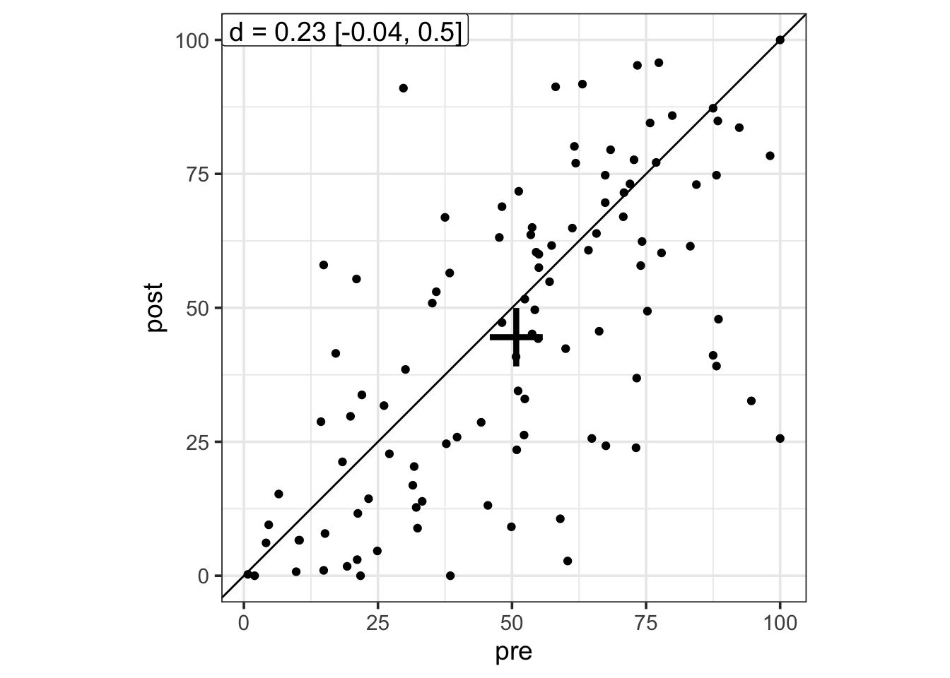
There are multiple ways to compute a Cohen’s d effect size for within-subject designs (e.g., see this post for five different ways to do it). By default, the brinley function computes the average Cohen’s d (as recommendended by Cumming, 2012), but note that this can easily be modified to compute your favourite Cohen’s d.
Next (here comes the augmented modified Brinley plot), we can colour points by a second continuous variable, to be passed (as character) to the colour argument.
brinley(brinley_data, outcome ~ session, colour = "pain")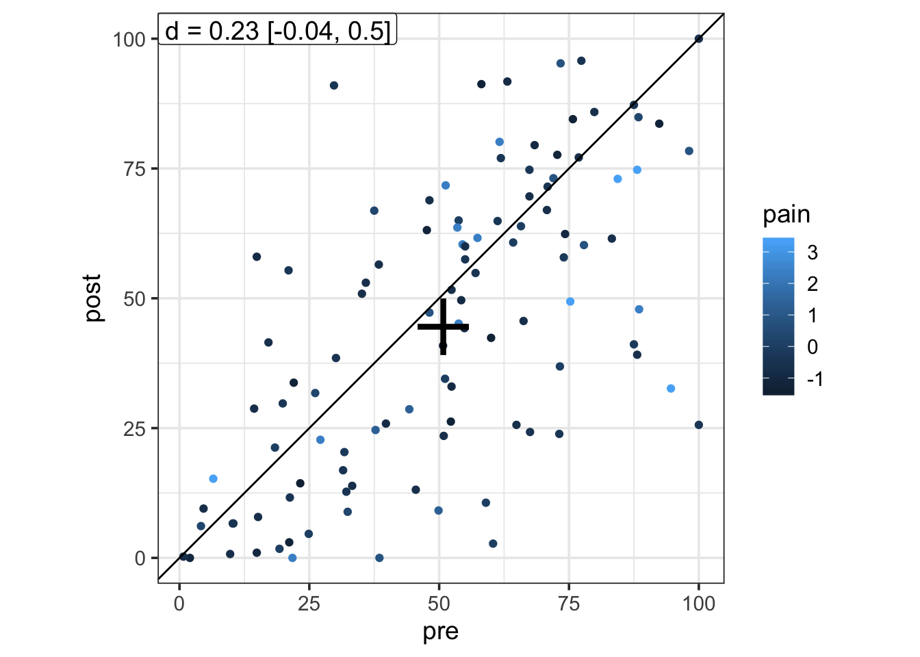
Or facetting by another categorical variable, using the facet argument, which is quite convenient to compare the effects of a pre-post manipulation in different groups/experiments.
brinley(brinley_data, outcome ~ session, facet = "condition")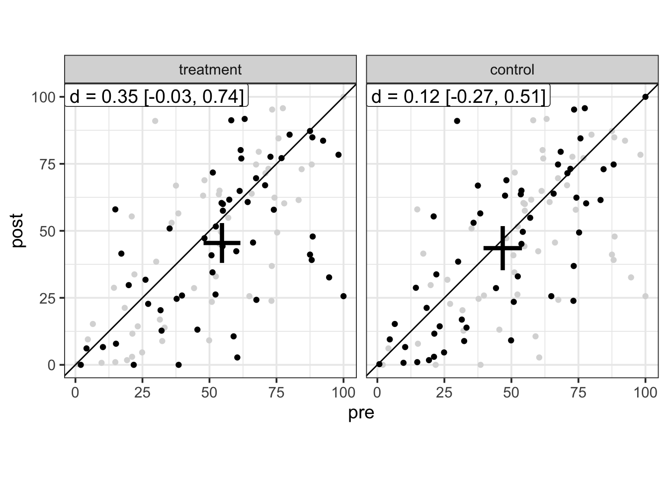
Moreover, the brinley function uses a smart plotting trick that allows easy comparison of multiple groups by plotting the whole dataset in background (see this blogpost). In our case (two groups), the grey dots represent data from the other group2.
Illustrative example
Let’s say we gathered data from two experiments (exp1 and exp2) in which we investigated a within-subject effect, in two conditions group1 and group2.
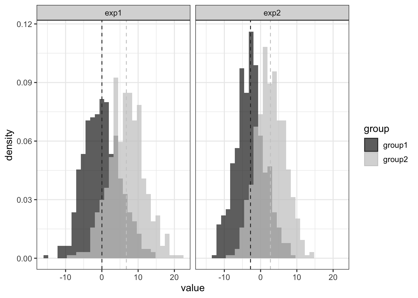
This plot reveals two overlapping distributions of scores in each experiment. Visually, it seems that the difference in means (indicated by the vertical dashed lines) is a bit lower in exp2 than in exp1. However, the standard deviation (the width) of the distributions in exp2 seems also a bit lower than in exp1.
Intuitively then, although the absolute mean difference seems lower in exp2 than in exp1, we could say that the effect size (defined as the standardised mean difference) might be roughly equivalent across the two experiments. Let’s check this.
library(tidyverse)
data(dominance)

dominance %>%
    group_by(exp) %>%
    summarise(
        d = effsize::cohen.d(
            d = value, f = group, paired = FALSE, pooled = TRUE)$estimate
    )
## # A tibble: 2 x 2
## exp d
## <fct> <dbl>
## 1 exp1 -1.37
## 2 exp2 -1.37And indeed it is. We have the exact same effect size in the two experiments3. But does it mean that the effect is the same in the two experiments ? Well, this is an very ill-defined question, but another way to compare effects (beyond merely comparing the d value) would be to ask how much variable is the considered effect across participants…
Stochastic dominance
This relates to the idea of dominance constraint or dominant effect (Rouder & Haaf, 2018), which is the idea according to which there exists some effects that are (in the population) in the same direction for any individual, although this might be masked in empirical observations because of sampling or environmental noise.
How is this relevant here ? Well, although we presented data from two experiments with equal sample size and equal effect size, maybe the idea of dominance could help us to reach a more fine-grained interpretation of this effect. Below, we use a modified Brinley plot to visualise data issued from these two experiments.
brinley(data = dominance, formula = value ~ group, facet = "exp")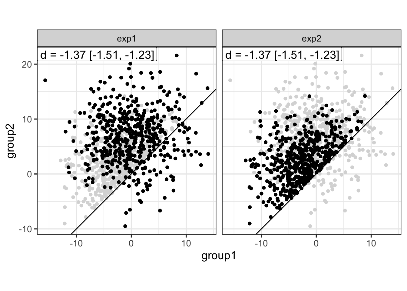
This plot reveals that, altough the mean effect size is the same accross the two experiments, the effect observed in exp2 seems prototypical of a dominant effect, that is, all participants (all points) show an increase from group1 to group2. In contrast, the effect observed in exp1 seems less “universal”, with some participants showing the reverse effect.
Of course, this is a schematic representation of an idealised dominant effect, in the sense that it would correspond to a situation in which there is absolutely no sampling noise. Alternatively, we could also consider that exp2 is a representation of a dominant effect in the population (i.e., a representation of what a dominant effect would look like if there was no sampling noise), while data from exp1 would be a representation of a dominant effect in ecological/realistic experimental settings (i.e, with some moderate sampling noise).
In any case, this highlights the need to report and to visualise data at different levels (individual vs. group) and in different ways to have a better grasp on what is happening in a particular experiment. In this perspective, modified Brinley plot appears as a handy tool to explore the idea of dominance constraint, and more generally, to assess to what extent our experimental manipulations affect the participants.
References
Click to expand
Barlow, D. H., & Nock, M. K. (2009). Why can’t we be more idiographic in our research? Perspectives on Psychological Science, 4, 19–21.
Blampied, N. M. (2017). Analyzing Therapeutic Change Using Modified Brinley Plots: History, Construction, and Interpretation. Behavior Therapy, 48, 115-117.
Brinley, J. F. (1965). Cognitive sets, speed and accuracy of performance in the elderly. In A. T. Welford & J. E. Birren (Eds.), Behavior, ageing, and the nervous system (pp. 114–149). Springfield, IL: Thomas.
Cumming, G. (2012). Understanding the new statistics: Effect sizes, confidence intervals, and meta-analysis. New York: Routledge.
Lamiell, J. T. (1998). “Nomothetic” and “idiographic”: Contrasting Windelband’s understanding with contemporary usage. Theory and Psychology, 8, 23–38.
Rouder, J. N., & Haaf, J. M. (2018). Power, Dominance, and Constraint: A Note on the Appeal of Different Design Traditions. Advances in Methods and Practices in Psychological Science.
Vautier, S. (2011). The operationalization of general hypotheses versus the discovery of empirical laws in Psychology. Philosophia Scientiae, 15, 105-122.
Vautier, S. (2014, unpublished). Une critique du conformisme méthodologique en psychologie générale : on peut aussi chercher des relations générales restrictives. Toulouse, France: Université de Toulouse. PDF
Ladislas Nalborczyk
Postdoctoral researcher
My main research interests span cognitive neuroscience and psycholinguistics at large and more specifically include overt and covert speech production, motor imagery, time perception, computational and statistical modelling, machine learning, and deep learning.